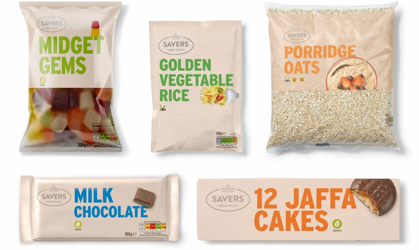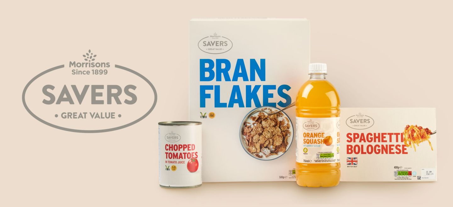
Morrisons Savers
Packaging
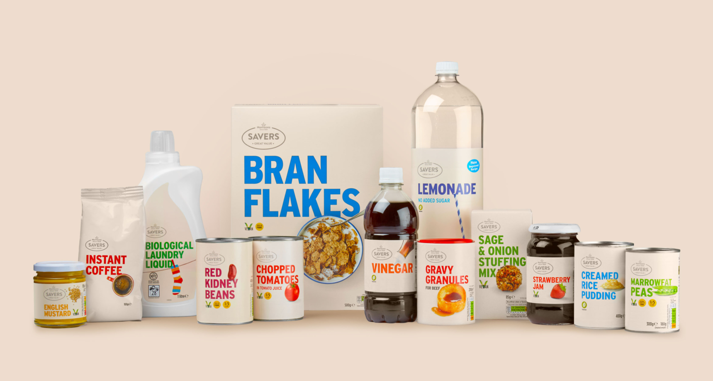
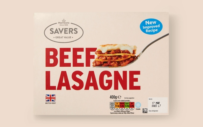
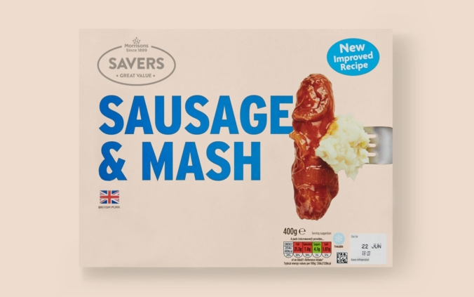
We’ve worked closely with Morrisons to redesign their Savers packaging and identity.
Full Description
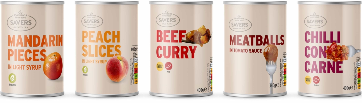
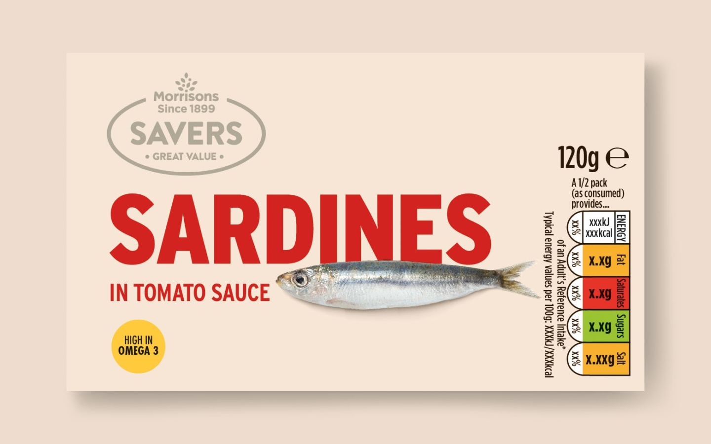
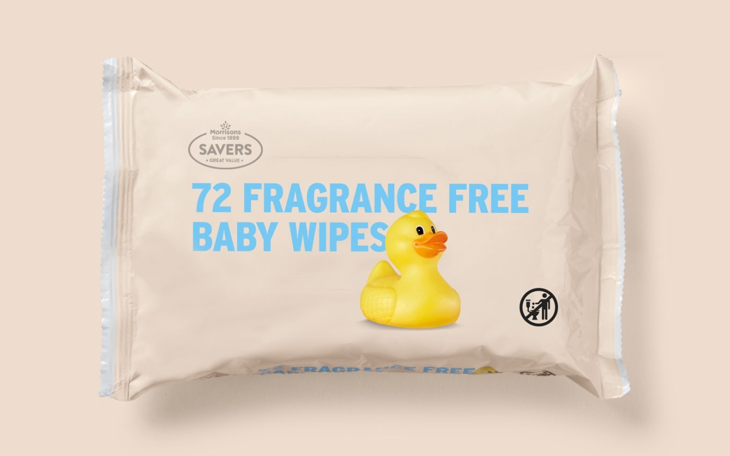
Loud typography really sets the new design apart. It’s confident, in-your-face and totally unapologetic about the values it stands for. This, working alongside a redesigned Savers logo and ownable colour palette, ensures a recognisable range across the many different categories that Savers covers.
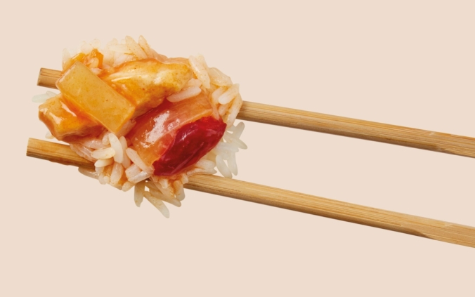
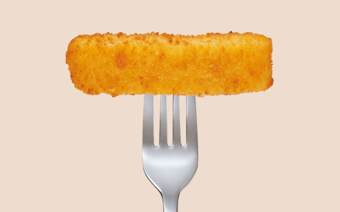
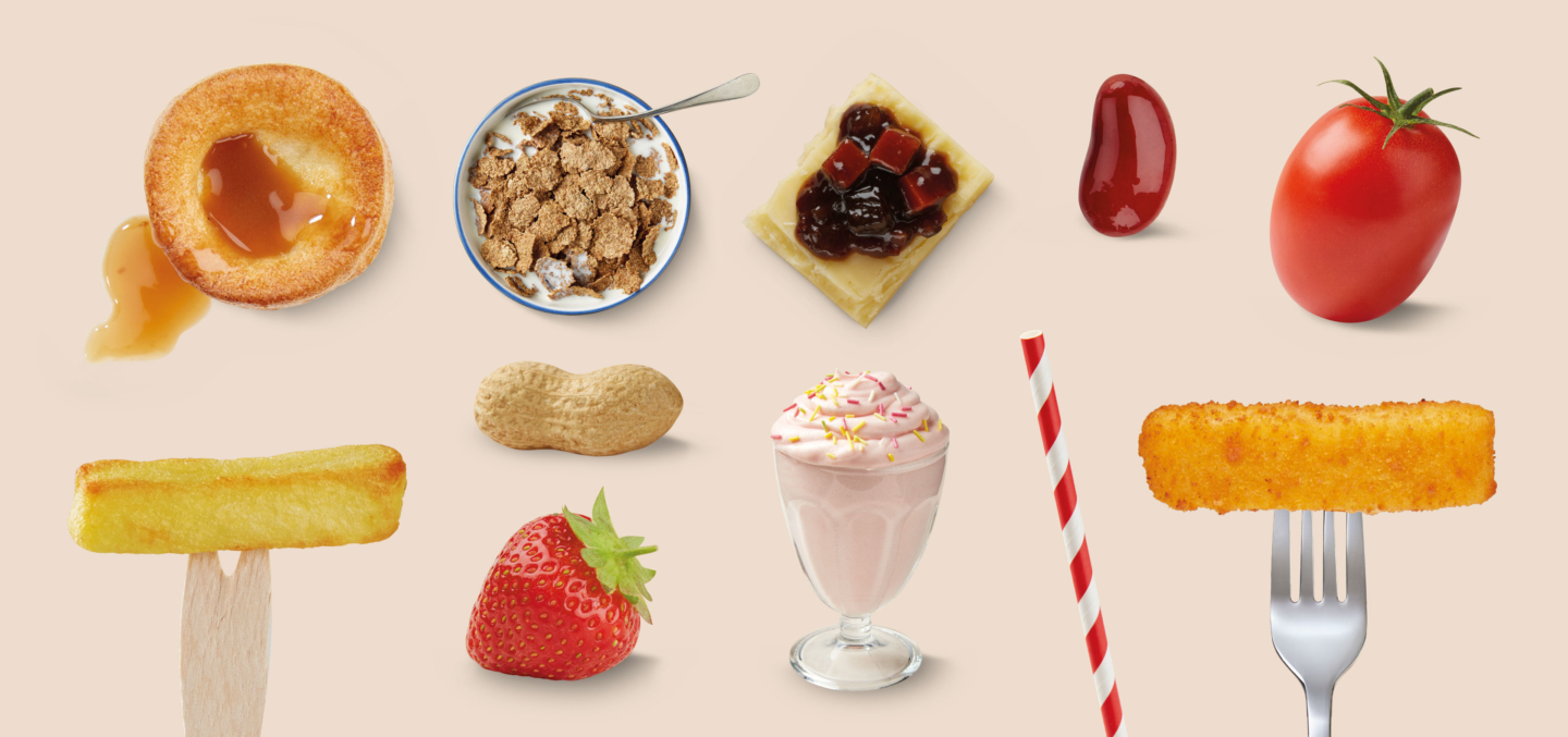
The range also utilises friendly, fun photography which interacts with the product titles, this further highlights the quality of the food and aids navigation across store.